Different CSS Display properties:-
- Block
- Inline
- Inline-block
- None
- Flex
- Grid
We will discuss the first four now and then will discuss flex and grid in the next articles:-
<!DOCTYPE html>
<html lang="en">
<head>
    <meta charset="UTF-8">
    <meta name="viewport" content="width=device-width, initial-scale=1.0">
    <title>Document</title>

    <style>
        div {
            background: rosybrown
        }
        span {
            background: red
        }
        img {
            width: 300px;
            height: 200px;
        }
    </style>
</head>
<body>
    <div>this is div1</div>
    <span>this is span1</span>
    <img src="https://hatrabbits.com/wp-content/uploads/2016/12/rare-combinaties.jpg" />
    <span>this is span2</span>
    <div>this is div2</div>
</body>
</html>
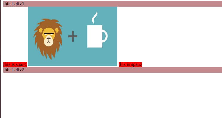
After writing this code the output is somewhat like this:-

So what can be inferred by this?
- By default the div elements take up a block display and the span takes up an inline display and the image takes up an inline-block display.
What is the difference between the block and inline elements?
- Block elements take up the entire width of the screen
- Inline elements take up the minimum space of the screen i.e the length of the sentence in the span case.
- Inline elements size cannot be changed.
- Block element size can be changed.
What the hack is inline-block? It is basically that it doesn't acquire the entire width irrespective of the width of the element but also is flexible in terms of resizing the elements.
What is display: none? It does like that the element never existed where it is supposed to if the display property of none were not applied.
So be careful in using these four display properties whenever required!
